How to read RollsRoyce Spreadsheets
I’ve been watching these Google sheets for a long time now, so it’s easy to forget that people want to know what all those columns mean.
Date, Time, Ticker, & Daily G/L% are self explanatory.
Epoch is a computer timestamp that is the number of ticks since January 1, 1970. That makes the column easily sortable with multiple dates.
Sect isn’t really sector. In some cases, I typed in a value to make it sortable and make sense to me. In most cases, this is really the industry name and not sector.
DP$ is the amount of the trade in millions of dollars. It may or may not be one trade. The darkpools like to break up trades into separate trades to fly under the radar of scanners. Those are sometimes called “iceberg” trades. After doing this for a while, I decided I didn’t care if the trades were a penny apart or maybe a little more. My system aggregates similar sized trades into the same row. That’s why you need the next two columns.
hi is the highest value trade in the cluster.
lo is the lowest value trade in the cluster.
That SPY trade in the third row is an aggregation of several trades that amounted to $1.2B. Highest trade in the cluster is 357.84 and lowest 357.76
DP%RTH compares the total volume of trades for that ticker to the 30 day moving average. RTH means regular trading hours, and the trade comes in with a real value price. RTH prints are different than the close prints which all come in at closing price (and we don’t know the trade price).
0% means volume is the same as 30 day moving average
-25% means 25% less volume
25% means 25% more volume
100% means double normal volume
DP%Tot compares the total volume of trades to the 30 day moving average. This column is inclusive of close prints.
In the same SPY row, SPY RTH prints are 35% below normal with total prints 46% below normal.
Price vs. Print compares the trade price to current price. Negative values mean that the trade price is higher than current (sell). Positive values indicate trade price is under current price (buy). As a rule of thumb, the farther trade price gets away from current price, the more likely the trade is a buy or sell. So the “redder” a print gets, the more likely it’s a sell and vice versa.
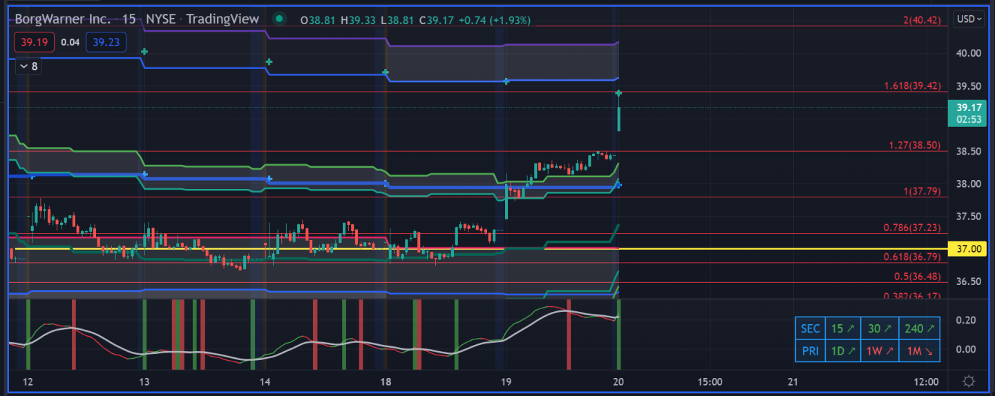
One thing to note that is important. The algos and darkpools work in a symbiotic relationship. The algos may be taking price up to a level to fill a darkpool sell order. That sell order can trigger and price keeps going up and overshoots the target. People in darkpool land call that a “splash”. The splash can also work in the opposite direction and keep going under a buy order. You’ve got to watch these prints sometimes for a few days to see what they are really doing. See BWA example below the spreadsheet.
Look at the $37 BWA print and how price behaved. Quite a bit of the time, you get a few days to ponder the print before it makes a move. This one banged around on the print for 4 days.


Do you information re: the color of these lines?
very helpful 👍